← Home

Three core systems, built from the ground up

As founding designer, I built the search, onboarding, and records systems for a college-readiness platform that grew from 6 people to a profitable team of 25+ on $10M+ raised, serving 13M+ students nationwide.
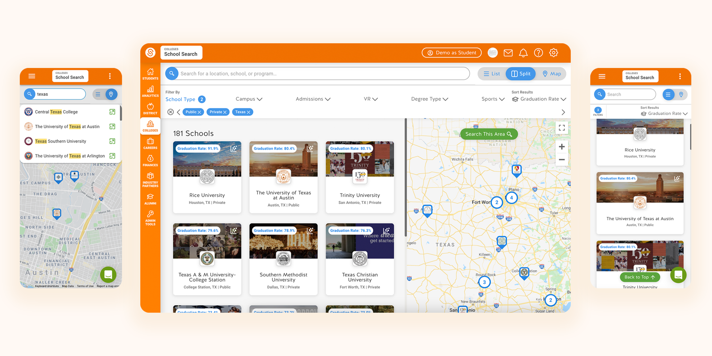
College Search in split view on desktop, with the list and map views on mobile
Role
Founding designer
Timeline
Feb 2017 – Dec 2021
Scale
13M+ US students
$10M+ raised
Team
Founder/CEO, Head of Engineering/CTO, 5 engineers per project
01 · Context and problem
The company

SchooLinks runs the college and career readiness backbone for US school districts.

I joined as the first designer when the company was six people. By the time I left, it had grown to a profitable team of 25+ on $10M+ raised, reaching 13M+ US students.

The problem

Most students navigate the process alone.

The average US public school has one counselor for every 464 students. Counselors rarely have time for even one one-on-one conversation about life after high school with most of their students each year.

02 · Impact

None of these numbers point to one project. They're what building the platform's first systems, then scaling the process behind them, made possible.

6 → 25+

People, now profitable.

$10M+

Total funding raised.

13M+

US students reached.

50+

Features shipped in 4 years.

“I was genuinely so much more excited about exploring colleges using SchooLinks than any other college search site.”

High school senior, usability testing participant
03 · What shipped
What I built

Three systems, each a different kind of zero-to-one problem.

College Search turned a filter-heavy database into a discovery experience for students who didn't know what they wanted yet. Find Your Path collected the data the state required by making onboarding feel like a game, not a form. The Transcript Center replaced an all-paper request process without losing the flexibility a human process could handle.

04 · The three systems
System 01

College Search

GoalBuild a search experience for the student who doesn't know what they want yet, not just the one who's been planning since fourth grade.
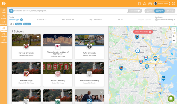
Key decisionI modeled it after discovery-first travel sites like Airbnb instead of the category's default: a searchable list buried in filters. Three interchangeable views, split, list, and map, covered the device gap between a new MacBook and an aging Android phone.
OutcomeMap view saw the lowest usage of the three, and I kept it anyway. The goal was never optimizing toward one perfect flow. It was catering to the breadth of students and the range of experiences they actually had.
College Search split view: result cards beside the map click to expand
System 02

Find Your Path

GoalCollect the data the state required for funding without students writing it off as one more inaccurate form.
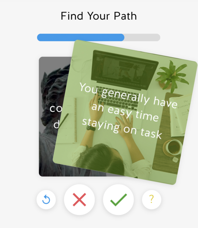
Key decisionI rebuilt the assessment to score after each swiped statement instead of at the end, cutting predictable later questions. Statements were rewritten in student language, and a celebrity-match reveal came before the career results, giving students a reason to trust what followed.
OutcomeStudents onboarded before their assigned class period just to see their celebrity match. What I hadn't built in was upkeep: the matches dated fast, and since this was often a student's first impression of the whole platform, we later built a lite CMS so content could stay current.
Find Your Path swipe-card assessment interaction click to expand
System 03

Transcript Center

GoalDigitize a fully offline, district-by-district paper process without losing the edge cases it had to support.
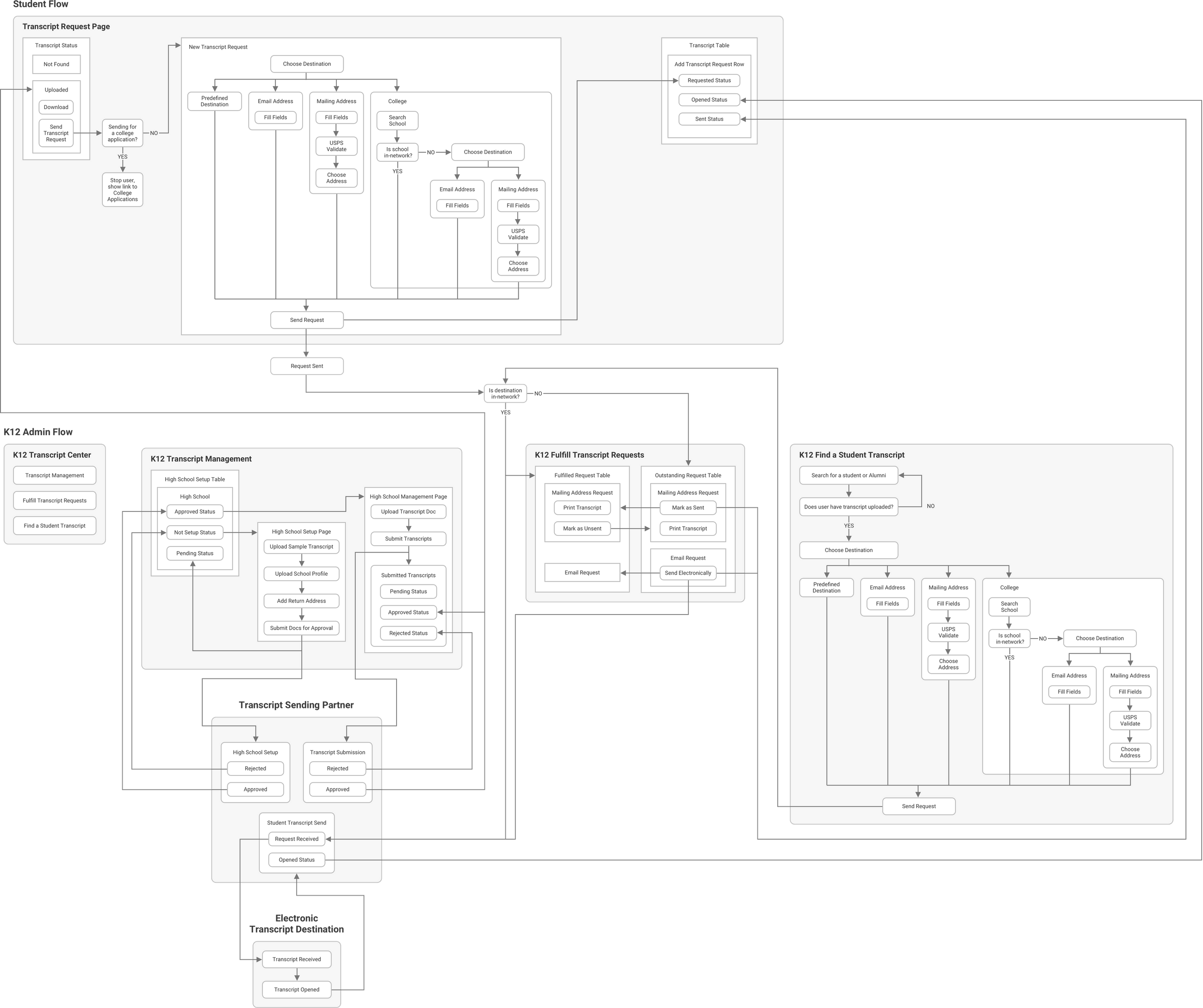
Key decisionI split college-application transcripts into their own flow and kept a human approval gate rather than automating requests end to end. We piloted with a small group of districts first to catch failure points before rolling out broadly.
OutcomeThe feature saved district staff hours previously spent on request logistics, time they could put back into one-on-one student sessions.
Information architecture flowchart for the transcript request and fulfillment process click to expand
{{ modalNode }}
05 · Reflection

We rebuilt the scholarship search almost entirely once we saw the eligibility rules were too complex for a search-first model, and moved to a more holistic model that weighed a family's full financial picture. Looking at the assessment screenshots now, the celebrities look dated. That's the part I'd fix earliest if I did it again: the launch designed the experience, not its upkeep.

Across all three of these, the metric I actually cared about wasn't usage per feature. It was whether we were catering to the breadth of students and the variety of experiences they deserved, not optimizing toward one perfect flow.