Designing A College Exploration Experience For Everyone

SchooLinks

Project Overview

A good search experience is essential for anyone going through the college discovery process. At SchooLinks I redesigned one of our core features to handle the wide range of needs demanded by our students, staff, and parents.
User Research
Interaction Design
Interface Design
Mobile Web
Desktop Web App
  • My role: Lead Product Designer
  • Tools used: Draw.io, Sketch, Invision
  • Project Timeline: 2 Months

Introduction

SchooLinks is an edtech company that provides a variety of services for school districts across the US. Our focus was on the college and career readiness process, commonly referred to as CCR. That process can vary wildly from district to district, and especially student to student, but at the core of all CCR products is a college search experience.

Though the space has evolved and expanded in the 20+ years of existence, a strong college search experience is usually the go-to feature in this category. Typically, this looks a searchable list of schools with a large number of filtering options to allow students and parents to find exactly what they're looking for out of a 4 year college.

Problem

The thing is, not all students know what they're looking for. Typically, CCR platforms have catered to the highly educated, highly motivated student (or parent) who has been thinking about and planning for college since elementary school.

School counselors are there to fill in the gap, but with a workload that stretches them to the point of breaking, it's often a miracle if they can even have a 1-on-1 conversation about post-secondary goals with all of their students each year. In many cases the end result is students having to navigate this process mainly by themselves.

Average student to counselor ratio across all US public schools:

1 Counselor

for every

464 Students

Solution

A college search experience designed for students of all backgrounds.

SchooLinks serves a wide audience across all school districts and demographics, so our college search needed to do the same. That's whether you’re a star student looking to narrow down your top choice, a parent trying to get their bearings, or a student just wanted to see what might be possible. We built an experience that worked for you.

Challenges

As mentioned, many of the challenges with this feature revolved around how essential it was for the CCR process and how different that process was for each student. We knew it was something we needed to get right, but being a seed stage startup at this time we didn't have the appropriate time and resources our competitors had to validate every hypothesis and backup every insight through rigorous UX research. What we did know were a few essential elements the experience need to have:

1. Appeal to power users and novices alike
  • Students come from different backgrounds, and they all deserve an experience that works for them. We need to design a search system that allowed for easy exploration without distraction, while at the same time giving advanced tools for further refinement as students became more educated on the college search experience.
2. Be usable by all stakeholders
  • Though students were our core users, the college search experience couldn't cater only to them. School counselors, parents, and even teachers needed to be able to use this feature in a way that could aid in a student's college discovery process without getting in the way.
3. Work on a variety of devices
  • Supporting all students meant supporting all devices. That means the latest Macbook as well as the oldest Android phone. The digital divide in US school systems is widely documented, and it was something we couldn't ignore if our mission was to serve students of all backgrounds with equity and respect.

Research

Due to our limited resources as a small startup, we focused our research efforts in two main areas:
1. Competitor Analysis
  • To innovate in this space, we needed to know where things stood. Fortunately, our team was made up of former high school students who had all used our competitors products in the past. While that was a good baseline, we took the time to find new competitors and audited their products as well to see what features were present, what worked well, and in what areas we could make the most impactful improvements.
2. Usability Testing
  • Luckily at this stage, we were partnered with a local charter high school who allowed us to conduct usability tests with a few of their students. We observed them using our competitors platforms, as well as ours, and had individual interviews with them after the fact where we went through a set of predetermined questions.

“I was genuinely so much more excited about exploring colleges using SchooLinks than any other college search site.”
– Senior Student

Sketches

After assessing the initial research and challenges I started sketching UI that improved upon our previous school search design while taking into account the usability feedback and feature set of our competitors.

Wireframes

Once the initial sketches were complete, I brought the design into a wireframing tool to start ironing out the details and making sure all features requirements were present.

Final designs for the

College Search Experience

An essential element of the college search design was making sure that we not only provided a better experience than our competitors, but also that we framed the experience in a way that our users hadn't seen before.

We took a lot of inspiration from travel sites like Airbnb and Vrbo. Their deft mix of discoverability and refined searching fit well into the context of searching for colleges as a high school student. After studying their experiences, and combining it with the work that had already been done, we came to a final product that served the addressed all of our challenges and user needs.

Multi search

Search is the starting point for both those who need quick access to a profile, as well as those just starting to dip their toes in. Our multi-search tool catered both to users who wanted a quick way to access a school profile, as well as a way to narrow their results by location or college major.

Results were displayed in three groups (field of study, college name, and location), in an effort to direct users quickly to the profile of their choice or allow them to further refine their search with a new query filter.

Personalized filters

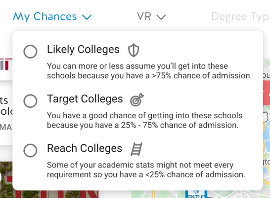
We provided a variety of filters that gave users flexibility in how they could narrow the colleges to their exact specifications.

For students, that meant leveraging the information already available in a CCR platform like your personal GPA, SAT/ACT test scores, and even family financial information to provide results that were catered to you. For parents and school administrators, these additional features were simply hidden from view.

College result cards

For our search results, we knew that photos needed to be at the forefront, enticing users to click through and view profiles they connected with visually. This was doubly important for those students who had no association to these colleges and were seeing them for the first time.

On the hand, they also needed to be functional and work with the applied sorting methods. Things like acceptance rate and graduation rate need to be visible but not disruptive to the overall experience.

Map & list views

Another key to our success was the different result views we made available to users. Due to the wide variety of screen sizes available in school districts, we had to make sure what we were designing would fit and feel natural on any device. We accomplished this with our view-toggler. Based on screen size and preference, users could search for colleges in any of the following formats:
The Split View
Ideal for larger screens, this mixed both approaches by showing the list and map together. As the user narrowed their search, they’d see both views react in real time to each other.
The List View
Ideal for mobile, this allowed users to easily scroll through colleges and order them from top-to-bottom based on the criteria of their choice.
The Map View
Ideal for exploration, the map view let users apply filters and get a visual representation of how what their options were geographically within the US.

Conclusions

One of our core features at SchooLinks is our College Search experience. Not only is it a key tool in helping students find the best match for life after high school, but it's also something that powers a variety of other features on the SchooLinks platform. In summary, it had to balance an intuitive, usable design with the flexibility of being used in a variety of different use cases. Though there were challenges that we faced with resources and a short project time, I think we built a strong foundation and a system that we were able to iterate on still to this day.